MISTAKES OFTEN MADE IN INTERIOR DECORATION
Sometimes we think of remodelling the interior design of the house without the need for such a large cost that it is necessary to call a carpenter. But, there are often some mistakes when modifying the interior decoration that makes the situation increasingly unattractive and uncomfortable to look at. What many of us do not understand is that interior design requires deep and knowledgeable attention. We may see something we like, but that does not mean that the item looks perfect in our home.
Mistakes can occur at the beginning of planning, in the process, including in the final stages. You have to be careful in every step. Your main helper is the plan. He will help to keep everything under control, and not be left behind for important things.
There are many mistakes that almost everyone makes when designing their interior. Let’s look at the 10 most common mistakes made.
BEAUTY VS FUNCTION
The main rule: there must be harmony in everything. This also applies to the ratio of beauty and function.
Of course, you can and should create beautiful and new designs, over time. But do not forget that after completing the renovation work in the room, you will need to live and do the cleaning in the room. Think about the function of the item in the future. Is it fun or more complicated?
You create a space design, think more broadly, and think of all the differences in beauty and function in a space whether there are children or animals in the house, temperature conditions, what will happen, and so on. Find the middle ground between beauty and functionality. It’s hard, but we’re here to show you.
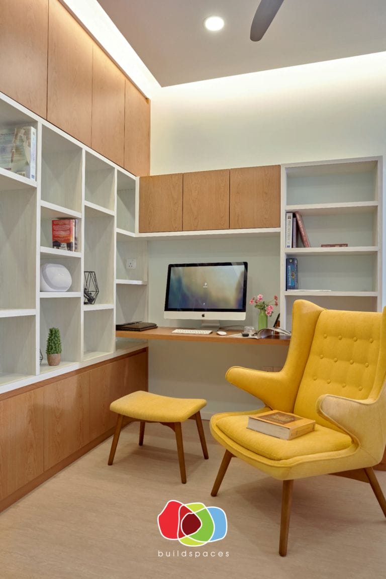
WRONG ARRANGEMENT
Among other factors that often occur are incorrect calculations at the beginning of the project. Of course, they can compensate in the future, that’s for the hired party. What if you do it yourself? Certainly, later you will have to sacrifice more energy, money, and time.
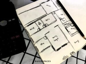
So work planning is a very important part. It all starts with a sketch of the plan. Draw a space plan according to the exact scale, play with the layout of the items according to the exact scale size on paper and then go to the actual object.

SPACE DIVISION
Initially, determine which areas in the space will be located zones, and instead divide them. This is done with furniture or colours. Errors were found in both the first and second cases. Observe colour determination from multiple zones, consider window locations, and do not mix multiple zones where there is enough space for just one.
Also common is the problem of lack of focus. Remember that there should be a centre in the room where a reference is made to the location of the section. Focus on one area with the main decorative elements or colours, and the rest are just additions and do not overlap or exceed the main one.
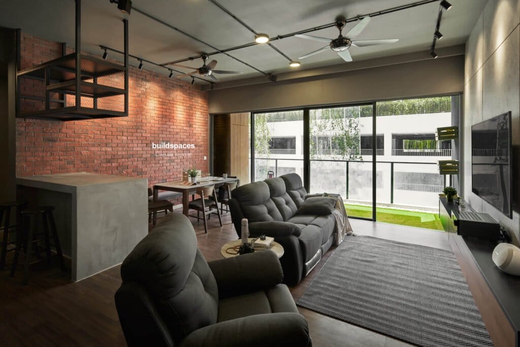
FURNITURE SETTING CATEGORY
Tone shelves are a famous layout fashi
This is also a zone space. But this is a separate topic that needs attention, as there is still a lot of gradation.
Furniture needs to be well arranged to function fully. For example, placing the bed on the wall is considered a big mistake. Modern design requires existence either in the centre of the room, or offset from the centre, but not close to the wall.
A pile of furniture is also common. Tables, shelves, chairs, armchairs, and beds. Use space efficiently and do not mess with large furniture.
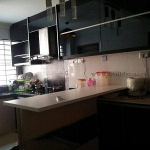
on in which distinct kitchen patterns/hues are blended into one. Unified cabinetry is now a element of the past, with -toned cabinets growing a cutting-edge, cutting-edge kitchen style. Dark decrease shelves paired with lighter worktops and shelves work in particular well collectively, but there aren’t any set rules! You don’t need to completely redesign your kitchen to get this look, you could truely update the ‘faces’ of your cabinets as a inexpensive yet nonetheless effective alternative. A popular preference of coloration is a army and white combination, because it adds each depth and brightness to your kitchen area on the same time.
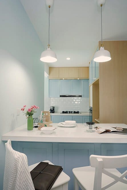
COLOR ERRORS
So, switch to colour. This is one of the basic factors. After all, a properly chosen colour scheme can hide flaws in planning or flaws in the layout of a space. The wrong colour combination can ruin the space even the most beautiful and fresh design.
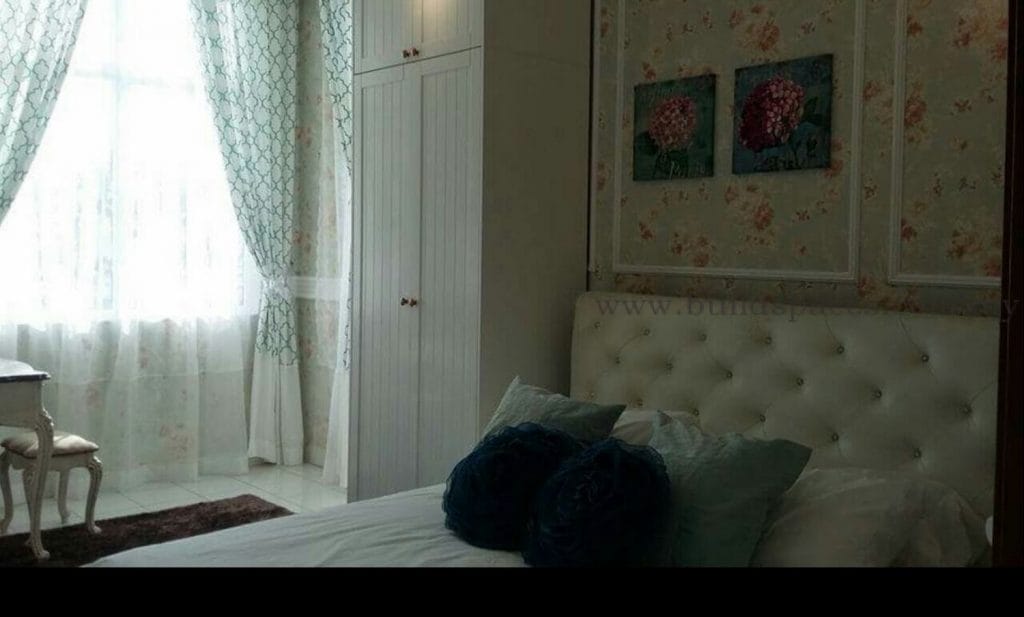
SOLID DESIGN
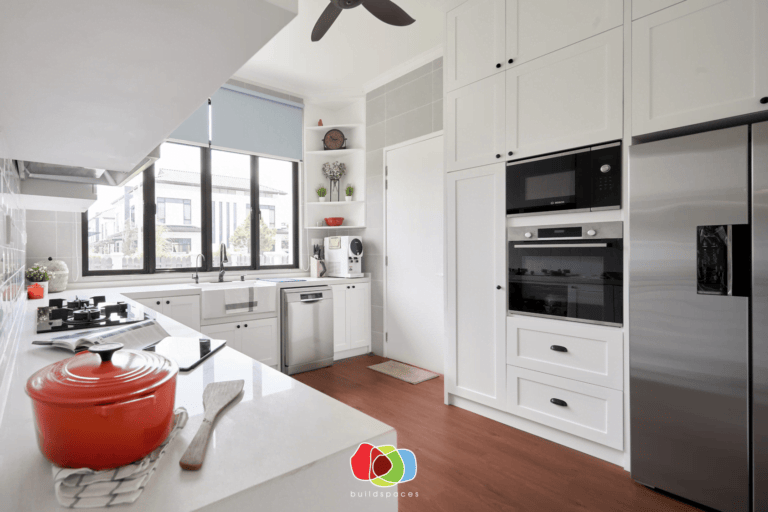
Current trends lead to simplification. In the new style, you will not find floral wallpaper combined with bright textiles and furniture. But in some cases, simplification leads to exaggeration. And, strangely, but there is an interior, decorated in the same colour. White and grey are now the pinnacles of fashion. Minimalism, loft, techno, high technology, and other modern trends love it. But do not go to extremes. There are other colours.
If you do not want your room to turn into a constant face-to-face place, add some bright information to the main grey or white.
TOO BORING
It’s not monotonous or dull, but it’s still too boring. Do not be afraid of brightness and uniqueness. Many are afraid to use red, yellow, and purple, as these colours are considered very bright and resistant. Nah! Yellow is the colour of the sun and joy, orange is the colour of love, red is the colour of passion and health. They can, and should even be applied.
Take a look at the psychology of colour, and you will understand that bright colours carry deep semantic meanings, so they need to be incorporated into the interior. But the main thing in putting colours like this is not to overdo it, if overdone, space will turn out to be too colourful. Try specifically to incorporate bright and colourful details into a boring life as a space drawer.

VERY COLOURFUL
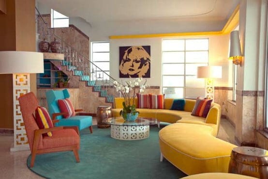
This error is also common. It sometimes happens because of the difficulty of choosing one or two colourful flowers. Like yellow, green, red, and orange. But you cannot put them all into space. In design, this is unacceptable.
Do not forget that bright colours have a strong influence on the human soul, and can cause certain emotions. Of course, the colour red will inspire but over time it can turn into something uncomfortable. Therefore, after painting all the walls in this colour, one should not expect a positive result. Apply selection technique – covering large areas in bright tones, but not the entire room. Attract the room in colourful colours, and you will get a lively and uncluttered interior.
STYLE DOES NOT MATCH
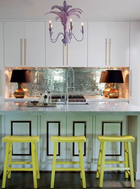
Of course, there are eclectic lovers, but this direction has long been a thing of the past. And if you want to restore it to the will of the landlord, work very carefully. This is not just a mixture of everything, it is the art of choosing things that are incompatible when combined, will create a complete and harmonious picture.
In this case, the main thing is to follow the canon that a particular style determines. Do not try to fit random objects into existing pictures. Do not take part from different directions, try to harmonize by combining them. Stay on one thing. Learn the basic principles of the style chosen, and follow them.
NATURAL LIGHT
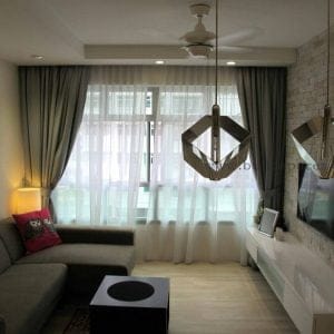
There is natural light in almost every room, and it needs to be designed properly. The most common mistake is the arrangement of windows we have either lacking or over-supply of light. If the second option does not occur often, then the first is more common and more dangerous. Learn room layout and location of all details; Consider for enough light to enter the room. If the repair involves expanding the window, or introducing a new one, well, go ahead. Otherwise, you need to compensate for the lack of artificial lighting and window decoration.
Another mistake that prevents natural light from fully fulfilling its function is improper window decoration. Here, build the opening configuration itself and the general style of the room.
Quite frankly, exposed windows in modern projects are common, because this is a modern style trend. This is a mistake. Modern design requires the right selection of curtains and offers a wide variety. Remember that window decoration is the basis of comfort in the room, and thus you will be able to add or remove natural light from the room and offset the shortcomings in the configuration of windows and the room as a whole.
Interior designers will first study and understand how the colours, lighting, room size, scale, and placement all affect the appearance of the item in the space and determine whether the item will make or break the interior design of the space. If you need a specialist, you can contact us to consult the interior design of your room.

